Why not go 3D?
With only a logo to go on, I was asked create engaging visuals that made POS software less boring and more vibrant.
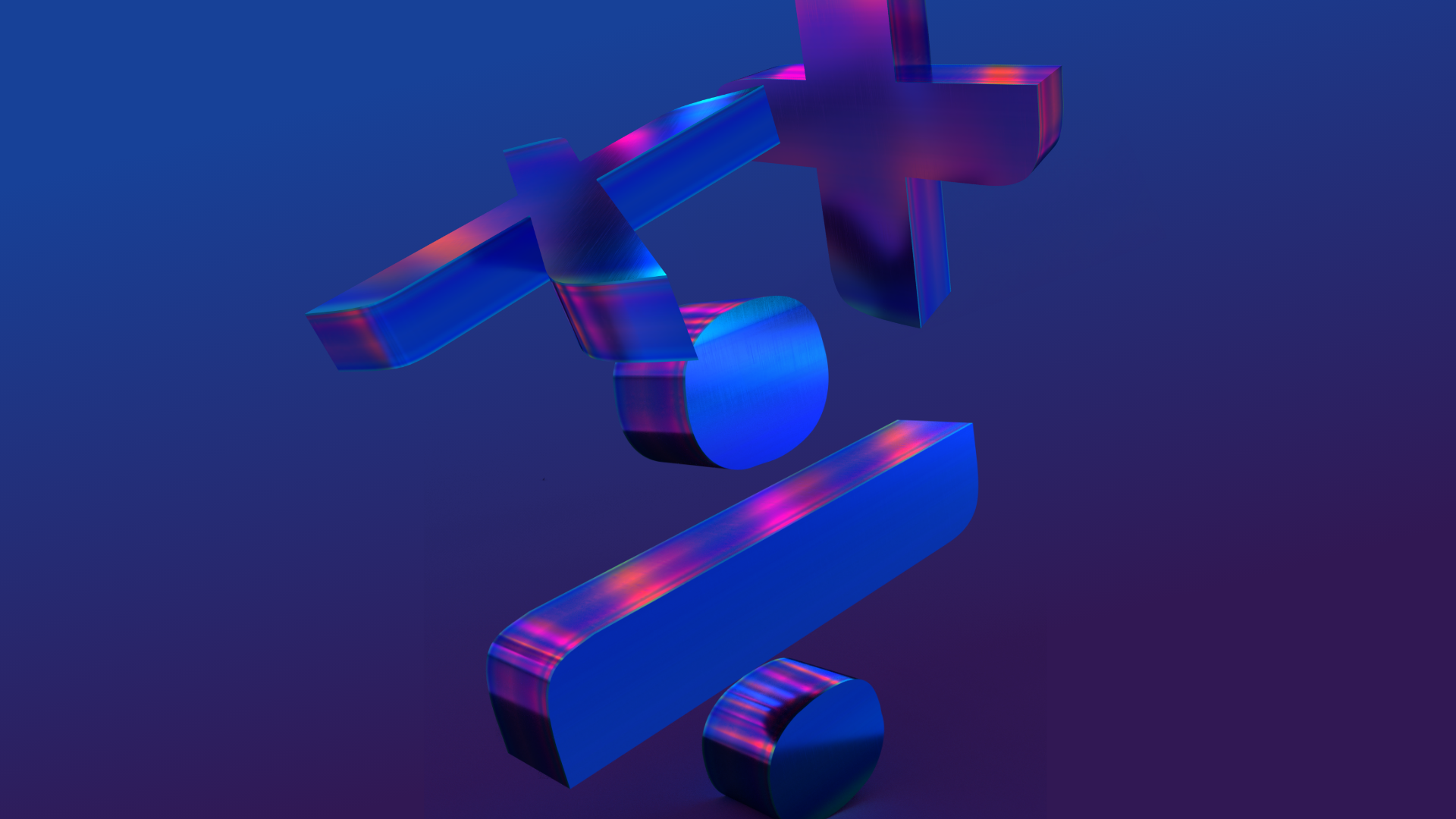
Working with 3D software, I wanted to create sleek assets primarily focused on the symbols within the existing logo. This eventually stemmed out to other service offerings and ideas, such as recycling and speed/efficiency.

There’s always a chance for colour.
Creating movable, adaptable 3D assets in the rule brand colours enables them to stand out off the background, creating complimentary colours due to their metallic texture and lighting, never blending in too much with the surrounding areas.
The colour-ways began as standardised corporate blues. As the brand fleshed out, I incorporated purples and fluorescent colours to enhance the brands visual appeal aiding its ability to stand out from the crowd.
There’s a light mode too.
The “light” version of the brand identity encourages the designer to use colour gradient overlays when working with images. In doing so, the blues and purples of RULE can show themselves off whilst also using imagery in a non-invasive way. This keeps things clean and simple.


