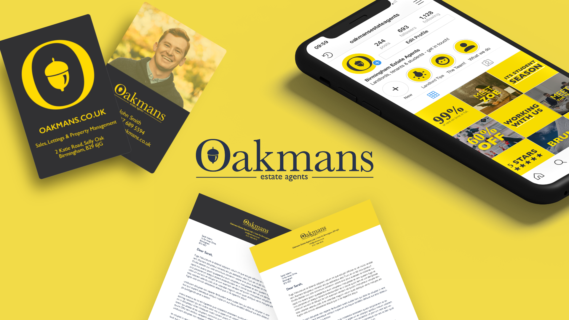
An updated logo and colour palette makes for a breath of fresh air.
Oakmans required a website design initially, but as the creative process began rolling the logo was updated and presented back to them. The new logo has now found its way onto their collateral, across their social media platforms and website.
Creating guidelines for a stronger brand identity.
The first step of the process was to create brand guidelines to help the Oakmans team navigate their new look and fee. Spacing of logos was extremely important, as I wanted their new logo to have room to breathe.
Why not throw in some illustrations and animations too?
Working with their new brand identity and reaching new audiences required that little extra push. Adding occasional animated and illustrated elements, we were able to push their brand identity further creating a laid back and friendly approach. As the brand developed over the three years I’ve worked with them, so did the illustration style.


